
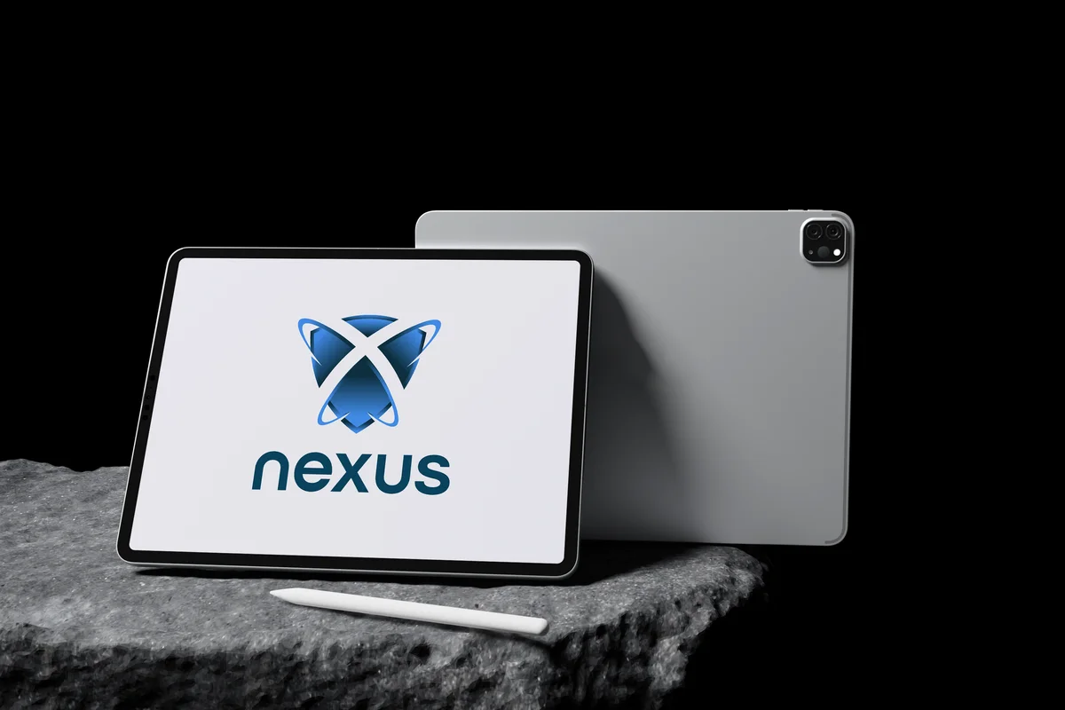
Project Overview
Nexus is a software development company that builds digital products for clients across industries. As the company grew, its visual identity no longer reflected the quality of the work — different projects, decks, and materials looked like they came from different companies. We were brought in to create a single, coherent brand that could scale across proposals, products, and marketing.
The Challenge
Software companies are a crowded field, and most identities look interchangeable. Nexus needed a brand that felt technically credible without being cold, and that could live comfortably across code-level touchpoints, sales decks, and their website.
Our Solution
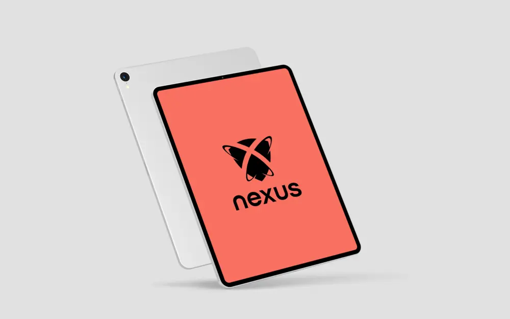
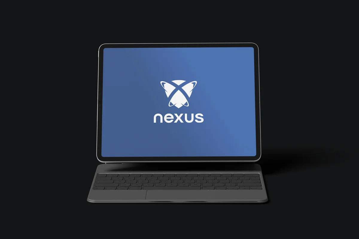
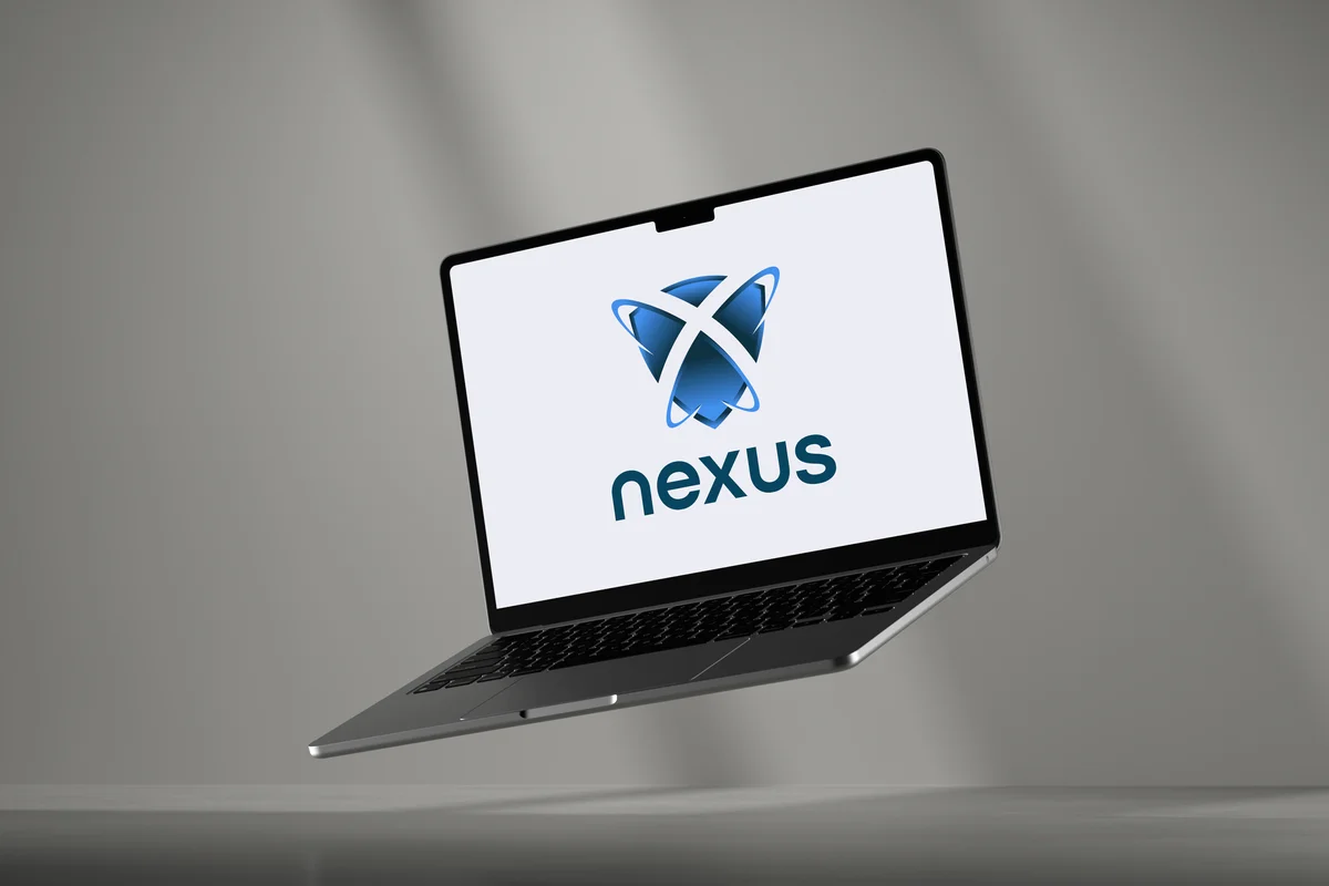
We built a clean identity system with a strong logotype, a disciplined colour logic, and typography that reads well both on screen and in print. We delivered a compact brand book covering logo usage, colour, type, and application examples, so every internal team produces on-brand material without guidance each time.
The Outcome
Nexus now presents a consistent, professional identity across its website, proposals, and client work. The guidelines give the team a simple framework to keep everything on-brand as the company scales.