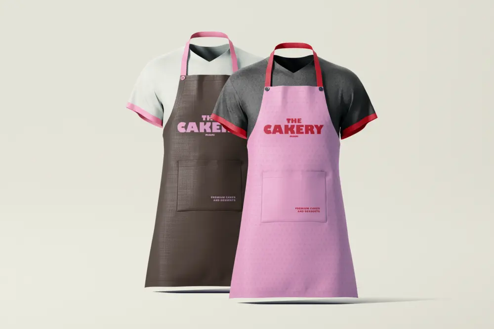
Project Overview
The Cakery came to us as a home-based bakery ready to open its first brick-and-mortar location in Melbourne's inner north. The founders wanted a brand that felt handcrafted yet confident — something that could hold its own on a high street while staying warm and approachable. We developed a complete visual identity system from the ground up, covering logo design, color palette, typography, packaging, and in-store collateral.
The Challenge
The bakery market is saturated with either overly rustic aesthetics or clinical minimalism. The Cakery needed a middle ground — playful energy with enough polish to attract a design-savvy Melbourne crowd and justify a premium price point.
Our Solution
We grounded the identity in a bold wordmark with hand-drawn lettering, paired with a warm cream and terracotta palette. Packaging became the hero touchpoint: every box, bag, and label was designed as a gifting moment. We created a modular pattern system from illustrated fruit and flora that could flex across formats without losing coherence.
The Outcome
Launch day sold out. Within two months the brand was featured in a local food editorial. The Cakery now operates two locations and uses the identity system across retail, social media, and seasonal campaign merchandise.


